


Some trends stay with us forever, turning into classic solutions. Others vanish without leaving a trace. You may think that all trends break into these two groups, but that’s not quite true. There is another category of trends whose life has its ups, downs and calm periods. Such trends keep appearing and disappearing all the time. One such trend is the use of split screens.
The split screen took the web by storm several years ago. It was incredibly popular in those days. There were even premium WordPress themes built around this approach. And that’s a big deal. However, slowly but surely its enormous popularity faded away and we started to forget about this interesting layout solution for hero areas.
Recently, it has awoken and reminded everyone about its incredible charisma with some tiny changes in appearance. Asymmetrical split screens are a new twist on the old trend that ignites passion and excites the minds of web developers.
Want to see it in action? Here are some great examples of how asymmetrical split screens are being used in the wild.


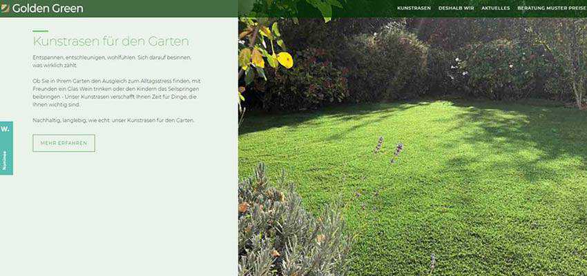
Nourisheats / Golden Green
When it comes to asymmetry, the first thing that springs into mind is, of course, the uneven division of the welcome screen. Nourisheats and Golden Green are two typical examples. Their hero areas are broken into two parts, where one of them is bigger than the other.
Nourisheats uses a split screen to turn a regular slider into a real centerpiece of the website. Note, this is not a traditional slider that cycles through a set of pictures; it is a full-screen navigation that supports the top navbar. Visitors have an opportunity to peek into two different sections of the portal at the same time.

The team behind Golden Green goes off the beaten path and uses a solution not for the hero area, but the entire website. Beautiful images come into the fore, drawing the overall attention and making the messages more dramatic. The team also alternates block arrangement to enhance the content flow and readability.
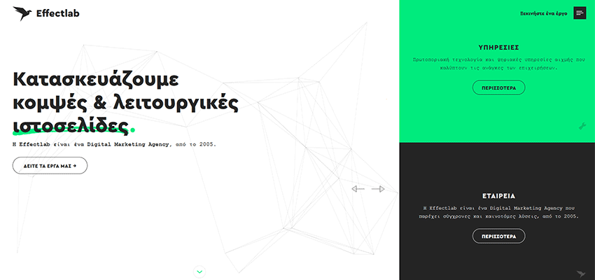
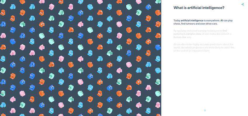
Effect Lab / Artificial Intelligence – Cytora
Another pair of examples that adopt the same technique are Effect Lab and Artificial Intelligence – Cytora. Both of them utilize a larger left side of the split. The reason is simple. The left side is the place where users begin to explore the screen. It is our natural reading behavioral pattern. So, it is a spot where something important should reside – like a logotype, slogan, etc. The team of Effect Lab did precisely like that.
They have placed the title and call to action into the left section that, thanks to its size and a generous amount of white space, naturally draw the attention. And the right side was turned into a complementary element that includes links to inner pages presented in a blog-like style. Thanks to vivid backgrounds, they get the visual weight that allows them to compete with the adjacent block, but still not win.
In the case of Cytora, the team has employed the split screen to make the storytelling experience more exciting. Since the topic is Artificial Intelligence, it can be a bit intimidating and annoying for some people. So, the team did the right thing. They managed to pick up the interest using animations that, thanks to a split layout, do not overwhelm visitors. Instead, they serve as pleasant accompanying material.
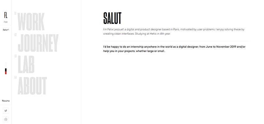
Home Societe / Felix Lesouef
Home Societe and the personal portfolio of Felix Lesouef present a group of seamless asymmetrical split screens in our collection. While in the previous examples, the right and left sides are easily distinguished thanks to vivid contrast, these two show a subtle, almost fragile nature of the concept.
Home Societe meets the online audience with a clean surface and lots of fresh air. While the first block includes a welcoming image and vertical navigation, the second one contains everything starting with the «About» section and ending with «Contacts». The transition between these two areas is pretty seamless: you gently flow from one part into another.

Felix Lesouef makes the most out of a minimal approach, not only in terms of content but also design. His portfolio does not look modest. It seems sophisticated and elegant. While you can delineate three columns, there are just two blocks. The first block includes navigation that is broken into two sections. It always stays static. And the second block shows the content, depending on the chosen option. Neat and clean.
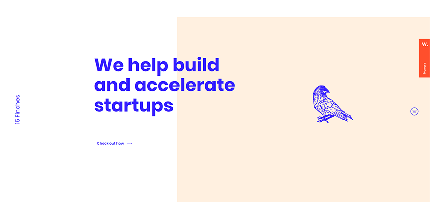
15 Finches
Here’s an example of how you can play with whitespace or overlapping to make things a bit more interesting. Consider 15 Finches. It is the same two blocks as in the previous examples. However, the team has added some vivid margins to the right block and let the title overlap it. In such a way the screen seems to be divided, but still both parts in here form one large picture. Simple and elegant.
Fru.it
Much like in the previous example, the team behind Fru.it also plays with whitespace to twist the split screen solution. As usual, here you can see two blocks. Note, they are identical in terms of width and height. However, thanks to the difference in image size, as well as lots of white space, the left block looks smaller than the right one. As a result, the latter has more significant visual weight and catches our eye better.

GQ Japan / Locomotive
GQ Japan and Locomotive present a small trend in sliders that utilize the asymmetrical split screen concept. In essence, the solution is based on a traditional vertically split layout, where the left side is bigger than the right one. In this way, the left side performs an accompanying role. You can place navigation, logotype, title, etc. in this area.
The right side is intended to bear the content. And that’s not all; there is another block that is located right at the intersection of the two sides. In the case of GQ magazine, it shows a picture, whereas Locomotive uses it to play a video. This block unites everything and, at the same time, serves as an eye-catcher. Clever and interesting.


Event Filming – NewFlight
One of the time-proven ways of introducing asymmetry in layouts is to use the diagonal line, like the team behind Event Filming – NewFlight did. Their slider with portfolio pieces easily separates itself from the competition, thanks to its trapezoidal blocks.
The traditional split screens that have two rectangle blocks evoke a feeling that the blocks follow one another, whereas the diagonal shape makes these two blocks look like two missing pieces of the puzzle that form one area.

Reasons to Split Up
When the split screen first appeared in the web design arena several years ago, it was used to display two different chunks of information to the audience simultaneously. Today, the situation is slightly different.
Modern split screens are used to make the layout more interesting, give the content a piquancy and present one block of information in a creative fashion.
The post Beautifully Designed Examples of Asymmetrical Split Screens in Web Design appeared first on Speckyboy Design Magazine.


