A lot of designers make a big mistake by creating overly complex, busy, and colorful web pages. If it’s not intentional, you should avoid creating complex interfaces and use more space instead. Space is a basic approach in web design, as it can bring a lot of difference to all the elements on the page.
In this post, we clarify the importance of negative space and share tips on how to use it right in web design.
What is negative space?
Before we start, let’s first define exactly what negative space is. Negative space, or white space, means any unused space on the web page. Anything that doesn’t catch the user’s attention on the page is negative space. This doesn’t mean the space should be necessarily white: it can be any color, an image, or any other background.
“White space is to be regarded as an active element, not a passive background.” – Jan Tschichold
There are two levels of negative space: micro and macro. Micro negative space is related to the space between small elements like lines, words, and letters, while macro negative space is the space between larger blocks or elements. Both of these levels are important for the overall effectiveness of web design.
Let’s take a look at the following web page designs that use negative space well.
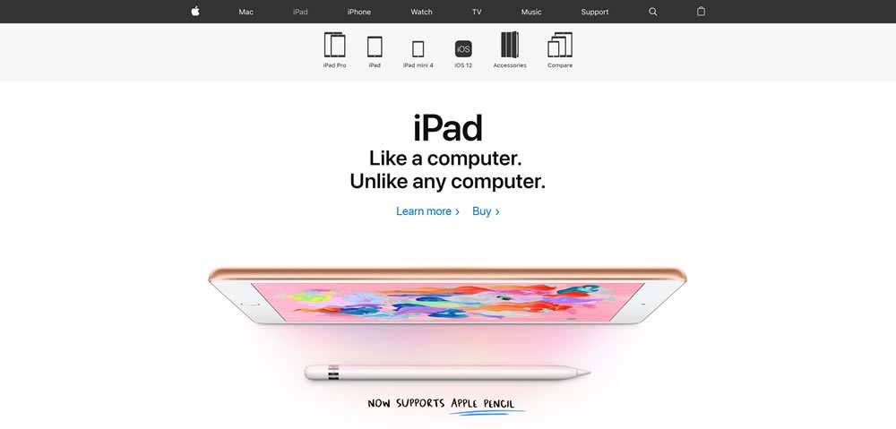
Apple
Apple has always paid great attention to design, and their own website isn’t an exception. Just look at how masterfully they use both micro and macro negative space. The website has a clean layout and an extremely clear call to action (CTA).
Your attention is focused on the core feature, the product itself, and nothing distracts your attention on this page. Having a single object to look at in the center of the page is a perfect way to draw the user’s attention.
Google is probably the granddaddy of negative space on the web. The search giant uses a lot of negative space and a clean design to drive our attention to the search bar itself.
Google simply guides the user to the most actionable areas of the page, namely Gmail, images, and the search bar. The design is kept clear and simple to avoid confusion.

Dropbox
The Dropbox homepage combines perfect micro and macro negative space, a natural color palette, and a harmonious font which creates a calming atmosphere and provides a smooth user experience. The website looks sophisticated due to the proper use of negative space, which in turn creates simplicity and cleanliness.

Shopify
The website for the Shopify eCommerce platform uses plenty of white space to achieve its main purpose: to direct visitors to sign up for a free trial. Shopify has surrounded the sign-up form with negative space to ensure visitors won’t miss it when entering the homepage. In addition, they’ve wisely displayed the site navigation in order not to distract attention from the main part of the page.

You can see that negative space literally allows your design room to breathe. Now let’s move to tips on how to use this negative space the right way on your website.
How to Use Negative Space Right
1. Use negative space to break up the page
Breaking up space on a web page is one of the most essential visual components in design. When a website has too much information and too little space, it’s extremely difficult for visitors to focus on the main information.
Negative space gives users time to absorb the information they see on the page. There are a few rules that help designers create symmetric compositions on the page and ensure that people can perceive the information. Equal space between components of the composition sets the proper design structure and helps users to clearly perceive information. According to the composition rules of web design, the space between these micro blocks should take up one-third of the space between macroblocks.
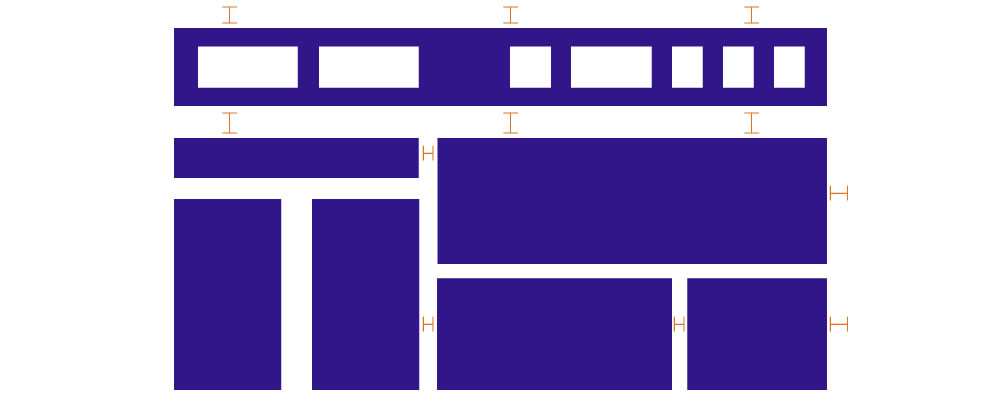
Breaks set the structural and semantic emphasis on the page.
2. Work on content comprehension
Content readability and legibility is a very important aspect in web design. Negative space can optimize both of them. Properly used space between lines, words, and letters increases reading comprehension by several times.
Paragraph margins and line spacing are two main things to keep in mind while optimizing content comprehension. The space between each line, or simply line spacing, increases the overall legibility of body text, as shown in the following example:

3. Create visual hierarchy
Negative space isn’t just empty space between elements on the page but is an essential tool for building visual hierarchy. Negative space can compose or separate UI elements so they create effective page design.
It provides a welcoming layout that keeps visitors on the page longer. In addition, negative space drives user attention to the important elements and offers a break for the eyes.
4. Clarify relationships
Gestalt psychologists, while learning how people organize visual information, developed the Law of Proximity. This law states that all visual objects located next to each other appear similar to the human eye.

In web design, proper negative spacing is an effective way to implement the principle of proximity and make a design more visually appealing. For example, this principle works well for blog architecture. By harmonically separating the bulk of text into paragraphs and blocks, designers can achieve a more digestible and pleasant layout.
The Bottom Line
As you can see, negative space is one of the most powerful tools in web design. By following some simple rules given in this article, designers can create a perfect visually appealing design that will be appreciated by any visitor.
The post How to Use Negative Space in Web Design Effectively appeared first on Speckyboy Design Magazine.


