


This is a case study guest article from Robert Katai.
Redesigning is an inevitable step that every company takes at some point in their development. But how do you know if it’s time to make this big change?
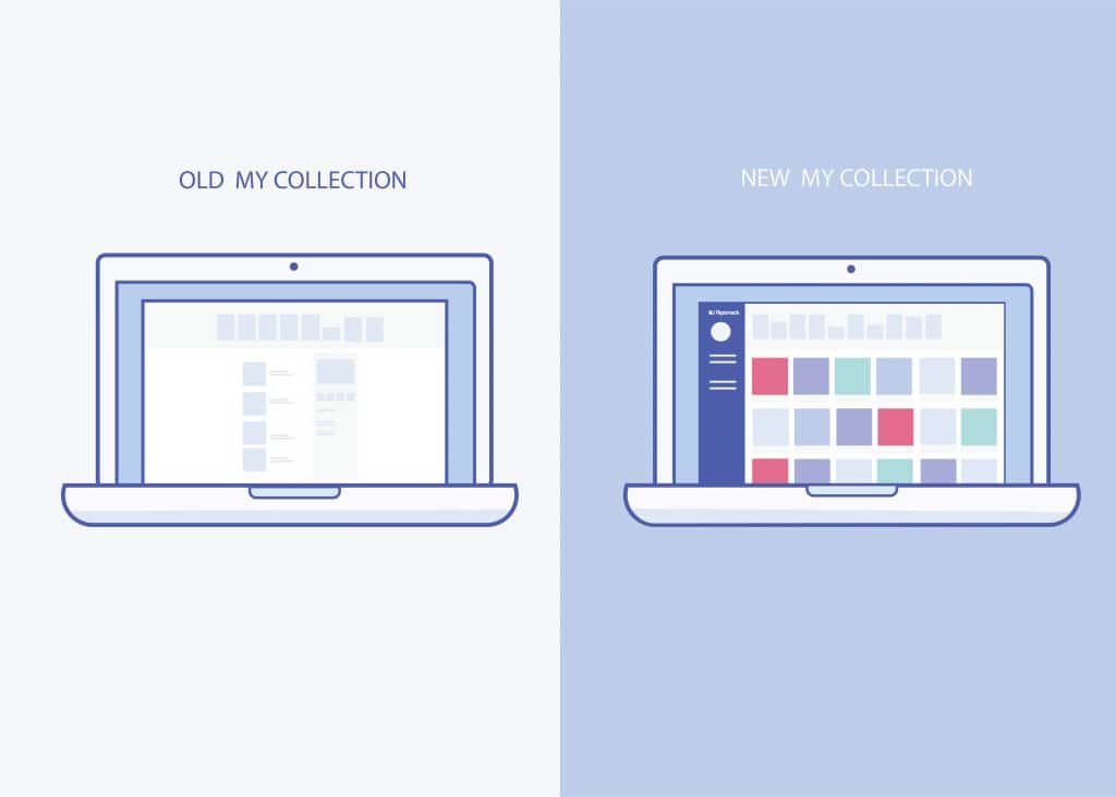
Sharing is caring, so we want to share with you our redesign story and how we knew it was time to redesign our “My Collections” page.
First, let me tell you a bit about Flipsnack and what we do.
Flipsnack is an online digital publishing tool which helps users create interactive flipping books.
The creation process of a flipbook is easy: you just upload your PDF files or you design the entire publication using page templates in the Flipsnack editor. Flipsnack has 800k active users and every month 30k flipbooks are created with Flipsnack, which are published and shared. “My collections”, is the place where all logged in users can access their publications, where they can edit, publish, share and organize their content.
So why the need for a redesign now?
Our biggest motivation was improving the user experience and satisfying our clients. We wanted to know their opinion about Flipsnack and how to make it better, so we sent an email survey. Their feedback helped us tremendously understand some of their pain points.
We made a list with the most important problems we found, which were:
- It was difficult to see all options for each publication
- There was no practical way to organize flipbooks
- Some important features were hidden
- Obsolete interface
- Too much wasted whitespace
Knowing our weaknesses, we couldn’t just ignore them. We had to do something to turn the interface into something new and useful. In that moment we knew it was time to redesign.
We discovered the needs of our users and we tried to find practical solutions to increase the efficiency. The implementation process was long enough. Our development team worked very hard to implement the design. But in the end all the hard work paid off, when we saw how well the new interface looked and worked.
In what ways is the new page different?
1. Improve usability / Getting priorities straight
People want to find information easily.
If you don’t structure the content well, you lose your client’s attention (and money).
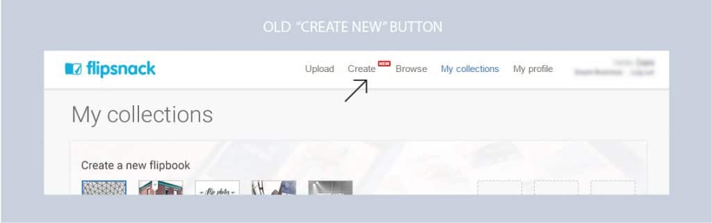
Unfortunately we faced this situation as well. The steps the users had to follow to edit, publish or make a copy of a flip book weren’t visible enough.
After the redesign, however, things changed.
Now users have a better overview of their flipbook collections.
If they want to edit a flipbook, they just place the mouse over the flipbook card and the options become visible. The user can edit, publish, share & rename it as he/she wishes.
The “Create new” button is more visible and invites users to add a new flipbook to their collections. Our templates are placed at the top of the page, making it easier for the user to choose one.

2. Easy to use/ User friendly
First impression counts!
For us it is important that users who interact with Flipsnack for the first time are pleased with our software.
Usually when a user signs up he immediately uploads a publication to test the application. After the PDF is converted into a flipping book, he wants to get the embed code to integrate it on his site. Sometimes in this process, the users couldn’t find important information. He spend time to find them, and he became confused.
Knowing this information about how users work with Flipsnack, we wanted to improve the flow. The redesign of “My collections” offers a better organization. The user can easily find the option he is looking for.
To make your app or website more user friendly you have to know their workflow. Find out facts like what button they click first, or what are their daily habits on your site. This way you’ll know what is necessary to improve.
Giving your users a great usability and a clean interface, will make them trust you. Knowing that your product is trustable, they will continue to use it.
3. More organized

We are obsessed with order and efficiency. We know how important it is to have all your files well organized in order to get a job well done.
The reason behind the redesign was to make it easier for users to classify and arrange their files. From our research, we figured out three solutions that will increase the efficiency of the user and will save his time.
- Large perspective. You don’t have to scroll that much to find your flipbooks. The new arrangement is definitely easier to scan.
- Search. You can sort publications by date and name, or you can just type the name of the flipbook that you are looking for.
- Folders. Adding folders is a new feature that helps you stay organized.
For us the solution was to organize things, but in your case it can be something else.
What you have to do is to understand your client. Empathize with them, and test objectively the product. In this way you’ll find out a new perspective.
4. Useful solutions

We care about more than just the arrangement of flipbooks on a page. We want to offer users a chance to grow their businesses.
Sharing options
The integrated social sharing options give users the opportunity to share publications on any social media platform they like: Facebook, Twitter, Google+, Linkedin, Pinterest, Tumblr, etc. This makes the content available to the entire audience of the publisher, on various channels. See here for social media tips.
Embed Code
Users can integrate the flipbook on their site, just by using the embed code. This way their customers can access the publication, directly from their website.
Email Marketing
Many of our users were sharing the flipbook link on email, so we realized there was room for improvement on our part. We found a solution to send flipbooks directly from Flipsnack, as a nice looking flipbook snippet. See here for email marketing tips.
Analytics
The analytics page is where users can see real-time stats: the number of impressions, views, average time spent on page, shares and downloads for each flipbook.
We also track devices and sources to help users understand how their audience is accessing their content.
SEO
SEO is very important for online businesses. We let users set the SEO title tag and write a meta description for the flipbook.
Your content will be easily reached by many readers.
Privacy
Because we care about the privacy of our users, we let them publish unlisted flipbooks and even password protected flipbooks, to cover their needs.
Conclusion
The redesigning My Collections was a great experience, from which we learned many things as team. All of us worked hard to finish the project and we were pleased about the results.
But the most important to us, was how our users find the new changes. So we asked some of them what do they think about the new “My collection” and here is what they answered:
“For me the best thing about this page is the fact that it emphasises on the two most important things in the website in my opinion: 1) easily navigate through my old flipbooks (and being able to filter them easily both through the left menu and through the filter above them) and 2) easily create any type of flipbook possible from scratch. I can find out what I’m looking for in a matter of seconds like this.“
“My collection was very easy for me to choose the project that I created, also gives you different option to do, you can choose to keep working, you can choose to share the project or to publish.”
The entire process of redesigning can be huge and very complicated, and you don’t know from where to start. Accept the challenge and just do it.
Don’t let the problems there on your website. Fix them and let your product grow!


