Web applications are the mainstream, trusted way to deliver content and product. But in a flooded market, how do you make your application helpful, relevant, and attract users?
With these 5 UX Design tips, your application is a step closer to a great product.
One screen, one task
Reduce the time required to perform the task.
Each screen (screen) you design should not have more than one call-to-action button. There should be only one goal with real value for usefulness. This kind of interaction is easier and easier to understand. For example: Uber knows that their audience’s goal is to find a carriage. The application does not abound with too much information, automatically takes the user’s location and the only thing the user has to do is choose a location.

Invisible User Interface
Content becomes UI
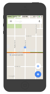
Focus on good content and delete unnecessary elements that do not play any role in performing the task. Put the focus on the information the user needs to be able to immediately find what he needs. Content becomes UI. Google Maps is a great example – all unnecessary buttons are removed for the map to be UI.
Whitespace
Use whitespace to draw attention to the more important content.
Whitespace, that is, the empty space between the elements is often ignored and ignored. A number of designers think that whitespace destroys much of the screen, but in fact it is a basic element for mobile design. It enhances visibility, readability and plays a big role for visual appearance. To a great extent, it simplifies the UI and improves UX.
“Whitespace is an active element, not a passive background” – Jan Tschichold

Simple navigation
Self-evident nav bar.
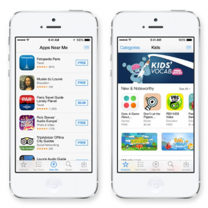
Mobile navigation must be visible, accessible and take up little space. The challenge is to make navigation easy to access, given that the mobile has small screens and needs to optimize the content. Bottom navigation is really affordable for applications with few options. The good side is that you have all the options and with one touch you can go from side to side.
One hand operation
Adapt your design to the larger screens
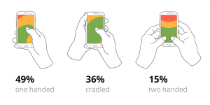
Every day, new devices with different screen sizes come out. Optimize your site for all devices. 85% of users use their hands on one hand. You can use this to adapt your design. The idea is to make your application easy to use on larger one-handed screens. Navigation should always be within reach of your thumb.
