Even though the world looked different in 2020, subscribers’ tastes and preferences continued to shape and change elements of successful email design.
Email design trends for 2021 suggest that people will be delighted to see newsletters with long text to indulge in good reading; big, bold typography to get vital information without extra effort; and interactive features to revel in dynamic user experience.
Read more about previous trends:
That’s not all. Let’s dive in to find out what email design trends will help you create newsletters that will resonate with audiences best. What features to use to bring joy to the audience and, at the same time, accomplish the mission set by your brand, leaving everyone happy.
Email Design Trends to Watch for in 2021
Personalization
We are going to start with personalization, which was a massive trend last year. Nothing’s changed. According to Litmus, personalized emails get 122% more return. Therefore, create a fully tailored persona-centric user experience.
Personalization in email requires several essential things.
With Postcards you can create and edit email templates online without any coding skills! Includes more than 100 components to help you create custom emails templates faster than ever before.
- Good segmentation.
- Use of name in the content. Even if you create a flash sale or other type of promotional newsletter that initially addresses a broad market, still the customer’s name should be right at the top. What’s more, it is highly recommended to use the client’s name in the subject line as well.
- Use of offers based on customer preferences or previous purchase history.
- Use of smart tags to customize the content in a way that will make the newsletter speak directly to your clientele. Choose information or promotions that bring value and tug at a customer’s heart.
- Use of visuals (images, illustrations, and other graphics) that resonate with the client.
- Create an individualized reader experience. Although emails with long text are a huge trend for 2021, there are still exceptions. Therefore, center user experience around your client’s preferences and tastes.
Nailing personalization requires work. It extends beyond email design: it implies personalized destinations, individualized landing pages, proper segmentation, and defining the best time. It pays off in the end.
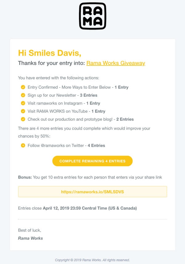
Consider newsletter from Rama Works and newsletter from Shipt.
The first email is a giveaway follow-up that is centered around the subscriber. It includes the client’s name, statistics, suggestions on how to increase contact’s chances in sweepstakes, and even personal signature. Rama Works is one of those brands that take their email designs and relationships with the customers to the next level by capitalizing on personalization.
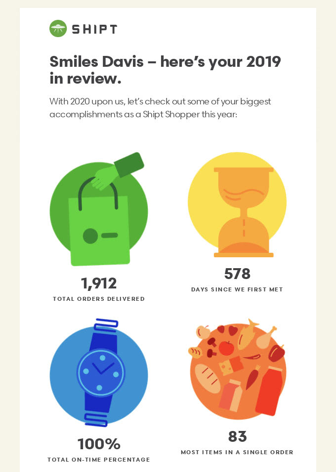
The second is a classic customer appreciation email that is veiled in “Year in Review.” This type of newsletter should be all about the customer. Therefore, it is highly personalized. It includes name, statistics that the shopper cares about, and a thank you.
Note the design. It is bright, catchy, and emphatic. The team has transformed boring data into a fantastic infographic that can be printed. The idea is ingenious. Not only does it cement relationships with the clients, but it also leaves them wanting more.
Long Text
Each year newsletter designs are looking more like traditional landing pages. They have a hero area, menu, brand elements, multifunctional footer, and of course, a vast content area. Some use animations and interactive features to enrich the user experience and enhance the statement. Therefore, it comes as no surprise that the long-read approach from the web design sphere has become a massive email trend for 2021. Though not only web design trends has influenced this tendency, the pandemic has also made its contribution.
Sitting at home and isolating ourselves from others pushed our society not only to go online and comment on all those Instagram stories but also read some good literature. This revived love for reading good material has taken this tendency to the next level. Email designs that give food for thoughts are becoming more and more popular among the crowd. Whatever sector you are in, if you have something to tell, then it is about time. Long read emails are one of the biggest trends for 2021.
To nail it, stick to these simple rules:
With Startup App and Slides App you can build unlimited websites using the online website editor which includes ready-made designed and coded elements, templates and themes.
- Use rich multimedia (images, illustrations, animated gifs) to support the statement visually.
- Use formatting to break reading flow into easily digestible chunks. It is here where you can play with whitespace, typography, headings, and paragraphs.
- Hit an optimal contrast since reading long pages can be difficult for people in the evening or on gloomy and somber fall and winter days.
- Check and double-check content on mistakes.
- Play with the layout to achieve compositional harmony and avoid information overload.
As a case in point, consider the newsletter from Absurd Design.

The newsletter example from Absurd Design seems like a personal correspondence between friends. This is the strategy that certainly cultivates strong relationships between brand and audience. Note several vital details that may help you to achieve the same effect with your email.
- A warm greeting with the name of the author that is featured right at the top.
- A friendly tone and an adorable “p.s. note.”
- Smart formatting. Paragraphs are carefully delineated. The generous amount of whitespace enhances the readability.
- Clever use of icons. Not only do they unobtrusively draw attention, but they also support an overly friendly atmosphere.
- Lovely illustrations that visually support the whole appeal and certainly give a nudge to the customers.
- A footer with all the critical information.
- Use of professional tools. According to Litmus, 52% of companies spend at least two weeks producing an email that can be too long to react to all the changes in 2021. This one was created in Postcards within minutes that not only ensures that all the details of the email work in agreement but also saves lots of time and money to the owner.
It should be noted that there are different ways to adopt this trend. You can stick to this powerful personal-like solution or make it more like a landing page populated with widgets and other sorts of content blocks. Consider newsletter from FitOn and email from Formula 1 as representative examples.
Newsletter from FitOn is a typical example of a long-read solution where you can see various modules that harmoniously co-exist together. There is a hero area, promo blocks, cards, header, and footer. Each block is a part of a fully-illustrated environment that establishes a Halloweeny atmosphere and sets everyone in a festive mood, making the reading experience highly enjoyable. Thanks to a proper organization, this long-read works. It gives food for thoughts turning customers into brand evangelists.
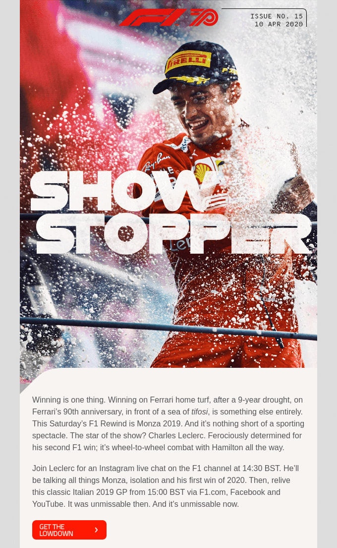
The second example comes from a big name, Formula 1. Therefore, expect some well-thought-out design solutions.
As you can see, the team skillfully adopts the long-read approach. There is a lot to read; nevertheless, the user experience is excellent. Everything is well-formatted and properly-organized. The newsletter looks like a compact version of an online magazine that wins over clients with relevant material and a powerful charisma of a famous motor racing championship.
Cards
As a method to organize content, cards have been with us for a while. With long reads gaining momentum, the foundation for this trend has become even stronger. Cards are a good way to deal with a bulk of data. As a time-proven and Google-approved design pattern, it serves content in a way that appeals to every group.
Basically, each card has an image on the top, content in the middle, and the footer at the end. While in the web design sphere it is animated, everything is static in the email design. Cards still enjoy all the benefits inherent to this design pattern, such as flexibility, responsiveness, neatness, order, readability, suitability, universality, and relevance.
Consider three good examples.
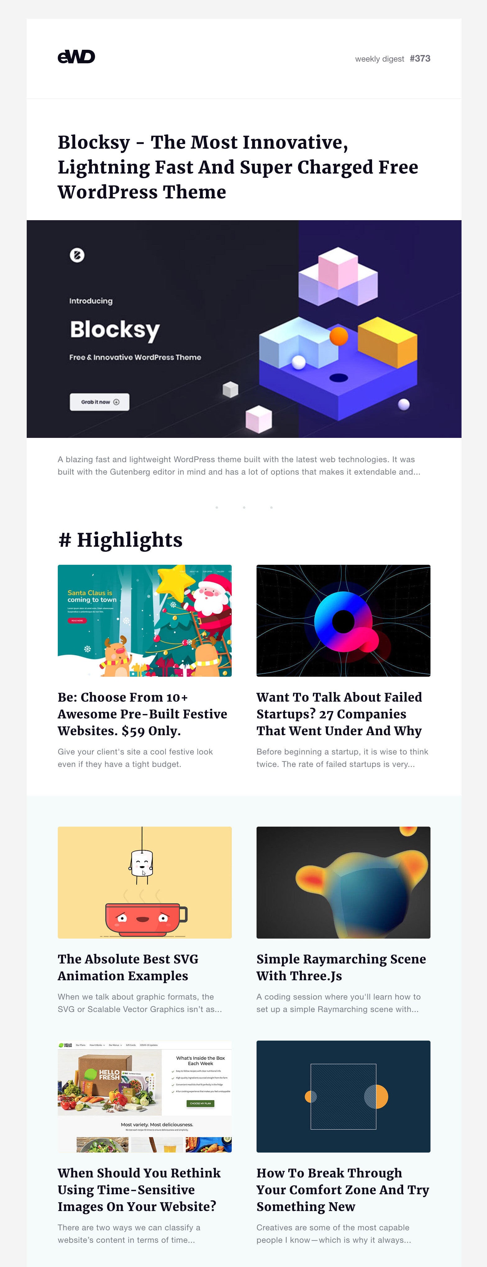
The first one is an email design example from eWD that successfully gathers a wealth of information under one roof. Cards organize all the content into blocks to create order out of chaos. As a consequence, subscribers can easily follow the reading flow and get interesting information right now.
On top of that, Cards also balances visual and textual data with grace, thereby producing a more significant impact. The newsletter sparks interest, increases engagement, and avoids visual overload.
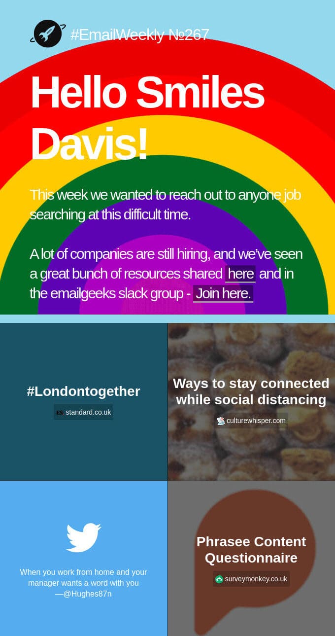
The second is eblast from ActionPocket. Being a regular email, it covers various sorts of information.
Note the organization pattern here. The team uses cards and a two-column layout, which bring some substantial benefits. Each piece of information has its own place, feeling prioritized.
It naturally brings the reader toward each CTA. It enriches the reading flow making it enjoyable rather than tedious and it unobtrusively guides the reader, thanks to the smart color block design.
Finally, it is flexible. It transforms into a one-column structure, securing the same logical flow across various screen sizes.
The last example is an email from Adidas. The email marketing team of the largest sportswear manufacturer in Europe also adores making the most out of cards. After all, it is a universal tool that is capable of sorting out various tricky situations. Though in this particular case, everything is pretty apparent.
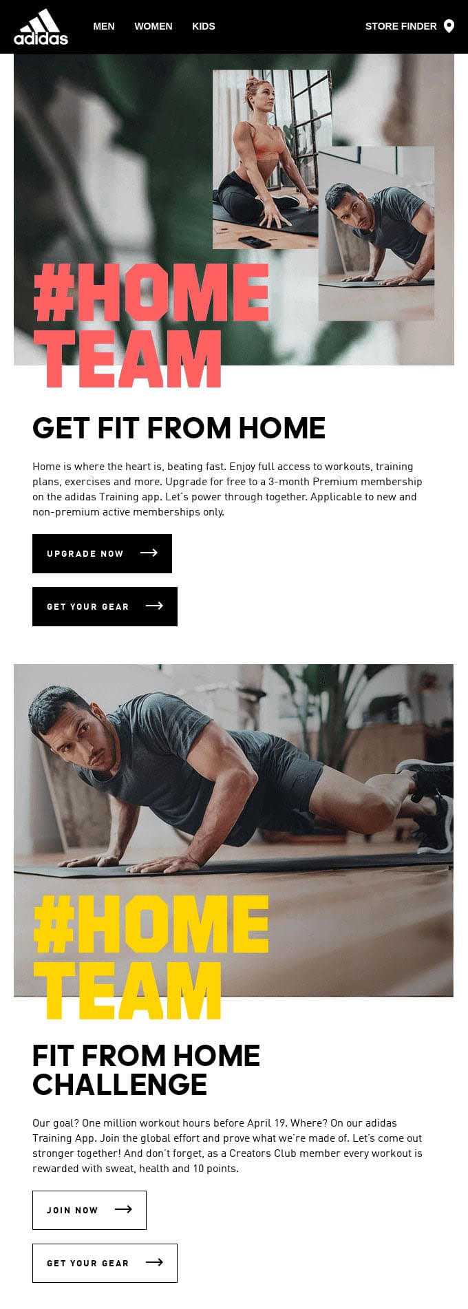
So, you won’t see here a long-read approach. It is just a newsletter with a regular length. Nevertheless, Cards proved to be very helpful in this situation as well. The deal is that the team uses overlapping techniques to emphasize headlines. Here Cards help to keep things clean, neat, and organized. They create a structure that secures good readability making content king.
Big Bold Typography
While some design elements are becoming smaller and more compact, others, on the contrary, are getting bigger and bolder. Huge and impressive typography is another email design trend for 2021.
As the main instrument for displaying text, typography is famous for its rich history of trends. Not a year goes by without typography bursting with a trend on its own. We have seen already oversimplified typefaces turning primitivism into subtlety, retro-inspired typefaces generating a wave of nostalgia, and handwritten typefaces giving designs an impeccable sense of taste.
In 2021, it is all about big and bold typography. And what can make a more prominent statement than that?
Overwhelmingly, big typography that screams out at you right from the doorstep is irresistible. You do not even need an eye-catching hero area with such a powerful asset in your toolset. Follow these ground rules not to ruin everything with its monolithic appearance and formidable charisma.
- Choose words carefully. Big and bold typography makes everything about itself. Whatever you say, it will undoubtedly echo in customers’ minds for quite a while. Ensure it brings about a positive image of your company.
- Use color wisely. Big and bold typography does not go well with glaring colors. It is too overwhelming. Stick to more neutral tones.
- Give it space. Big typography needs ample outer space. Therefore, be ready to use some extra room. However, do not overdo, since too much air to breathe can also ruin the readability.
- Make it responsive. It takes extra effort to fit big and bold typography into a small screen. Remember, there is no much real estate on phones; therefore, your email design should not be all about letterforms.
- Make it accessible. If you intend to introduce some hidden message into big and bold typography, make sure people who use AT get it.
Consider a newsletter from Adobe. When we say big and bold typography, we mean it! The hero area is impressive. It is even a bit overwhelming. However, thanks to the creative use of whitespace, optimal coloring, and extra blocks with content, it does not bury you under the words. It just gives a head start to the newsletter. As for the message, the typography delivers it without questions asked. It gets straight to the point.
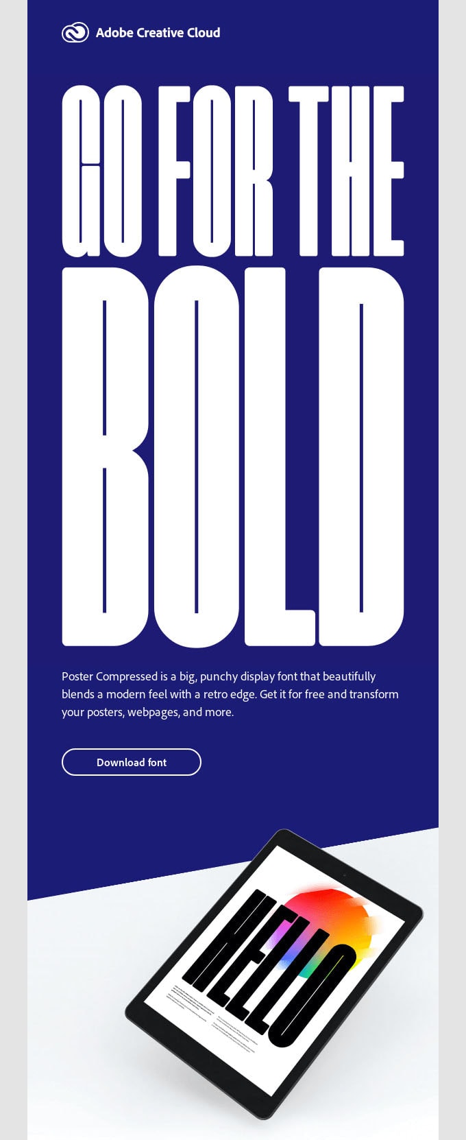
Although the newsletter is dedicated to typefaces, it does not mean this approach won’t work in other situations. On the contrary, as a tool for emphasizing the headline, it will certainly fit the bill, whatever product you intend to promote. Let’s consider two more examples to prove this in practice.
The first example is the email from Musicbed dedicated to Salomon Ligthelm. Three main features make this design stand out from the crowd, and big and bold typography is one of them. It creates an impression from the first seconds, conveys the message, and adds personality to the overall design. It stands behind the aesthetics that naturally sparks curiosity and interest.

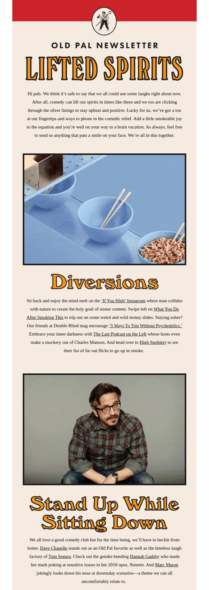
The second example is the newsletter from Old Pal. Unlike two previous cases, this one can’t boast of overwhelmingly big typography. Nevertheless, it is still larger than the average options. Size stems from the fact that it is featured across the entire newsletter. It is used in the header, content area as headlines, and even in the footer as a brand note. It has quite a strong personality.
Ultimate Grey and Illuminating Yellow
Want to be trendy? Like it or not, but you can’t do without a modish color scheme since it affects all the details of email design: heading, paragraphs, call-to-action, background, hero area, icons, controls, etc.
Pantone picked two colors of the year for 2021: ultimate grey and illuminating yellow. They express a message of positivity and strength and give us resilience and hope: two things that we are craving so much at these uncertain times.
Though, it should be noted that you are not stuck with these two tones. They are a solid foundation on which you can build on. If you need some inspiration, you can always get some valid ideas from fashion week shows. To save your time, Pantone has already done this job. Check out the article called Summer Bouquet, where you can find several great color palettes that give any email design an adorable feel.

Consider an email from Ritual and an email from Haus that have already put this color palette in action, enjoying some early benefits of looking trendy.
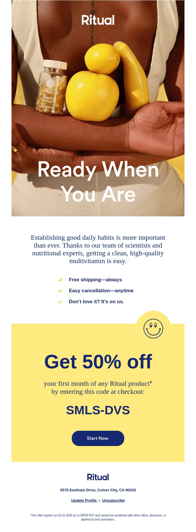
The newsletter from Ritual uses both colors in the design. Yellow and grey are skillfully featured on a hero area and CTA block. Note how they lovely collaborate. This trick helps breathe fresh air into an email design, making it feel refreshing and emphatic. The great thing is, this subtle hint on the trendy coloring does not distract attention from the main goal. It unobtrusively emphasizes the message and leaves a long-lasting impression.

The second example gets beauty only from one tone, grey. Nevertheless, this does not prevent it from looking stylish and producing a positive gamut of emotions that are increasingly vital for keeping your relationships burning in 2021.
It creates a solid foundation for adopting other design solutions. As you can see, splashes of bright colors, big smooth shapes in tandem with authentic imagery, and bold giant typography (again) nicely collaborate with each other opening vast opportunities for playing some marketing tricks.
Authentic Imagery
Authentic imagery took the website design sphere by storm several years ago, forcing brands to avoid stock pictures and create unique photos. As a result, websites from various business sectors delight the online audience with beautiful, striking imagery that bears the company’s charisma and atmosphere.
This tendency has finally reached the email design sphere. It is gaining popularity and we expect it to be one of the biggest email design trends for 2021.
The great thing about authentic imagery is that you are not limited. You can let your imagination run riot. All your efforts will be rewarded since people love unique things.
Consider the email example from Magic Spoon Cereal that drives traffic to the website with its authentic imagery. The hero area is impeccable. It looks so “delicious” that you want to get this cereal right away.

Note two things. First, this custom imagery not just throws a spotlight on the goodies, but it also promotes the brand quite effectively. Second, it has an excellent quality that instills trust in a brand.
3D Images
Three-dimensional images are a sub-trend that is incredibly popular among big names — Adidas, Apple, Google — all of them capitalize on this tendency. Scenery has that adorable feel of 3D that creates a buzz in a flat web universe. It is difficult to resist, especially when a 3D image is set in motion. Therefore, if you do not want to create a photoshoot due to pandemic reasons, you can always hire a graphic designer to create an artwork that will give your email design an irresistible flair of skeuomorphism.
Consider two big names, Google and Apple, that cash in on this tendency a lot. Both of them employ outstanding 3D images in promo newsletters all the time.
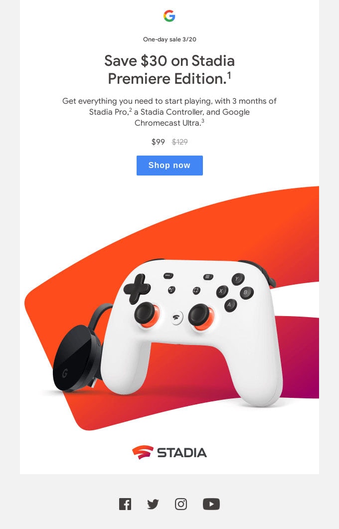
The first example is a newsletter from Google. Right off the bat, the biggest search engine places itself as the best provider of fun. The atmosphere in the design is incredible. The 3D image looks simply “tasty.” You just want to grab this controller right away and start to play immediately. It is the same effect that we see in the newsletter from Magic Spoon. Indeed, well-thought-out imagery works wonders. Note, there is no other supporting material. The 3D scene and some sweet discounts are all Google needs to drive traffic and generate leads. Brilliant.
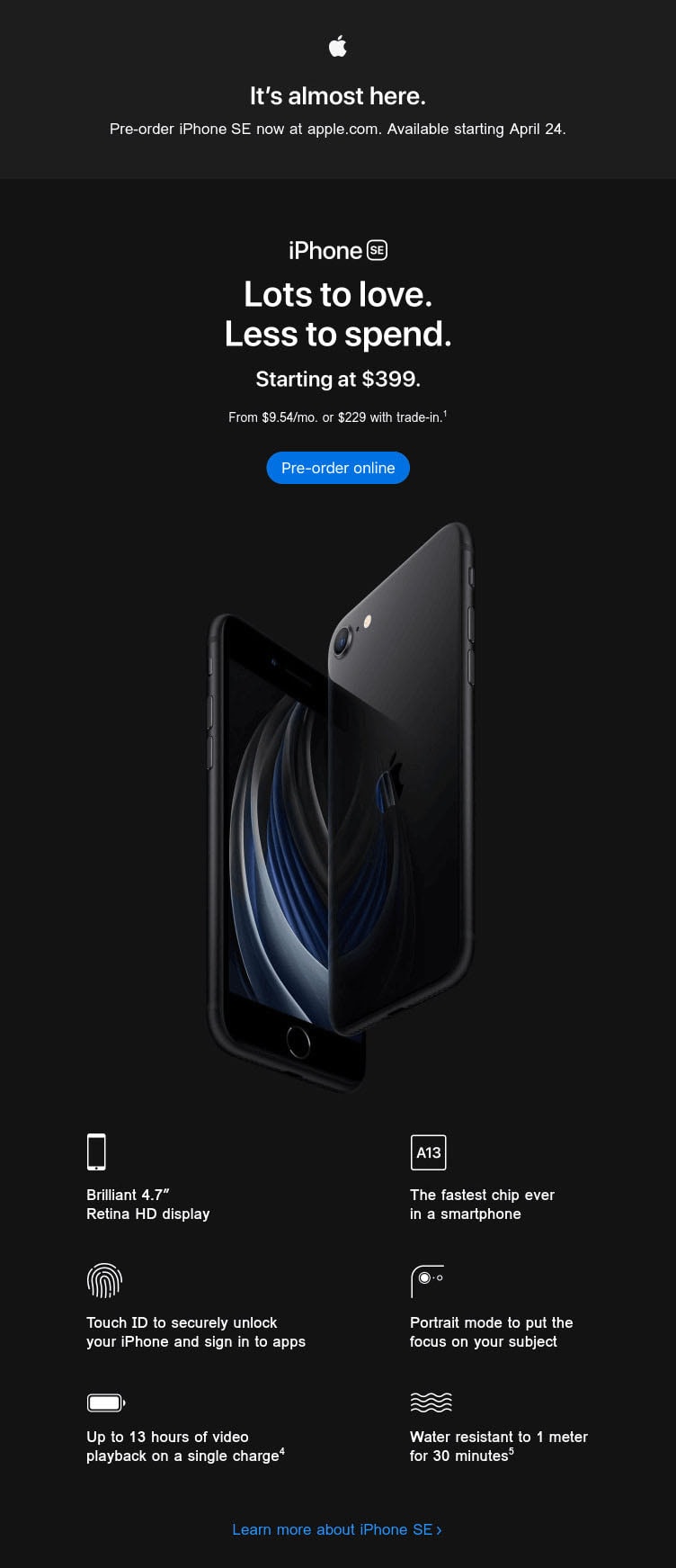
The second example is Apple, whose team, unlike Google, was opted in favor of a traditional promo newsletter. Its goal to draw attention to a product, complementary accessories, and the brand itself. Note 3d image in the hero area. It is just amazing. It speaks louder than words showing the product in all its glory. It is a good start for an email newsletter that sets high expectations for the rest of the design.
Illustrations
Along with authentic imagery, illustrations are gaining popularity. Though, they were never actually lagging behind. People love art and always will. With a fight for equal rights and tolerance, 2020 breathed new life into the approach. Quirky and surrealist illustrations that stay away from perfection are increasingly popular. You are welcome to use them throughout the entire design, but if you set them in motion, you will certainly take this trend to infinity and beyond.
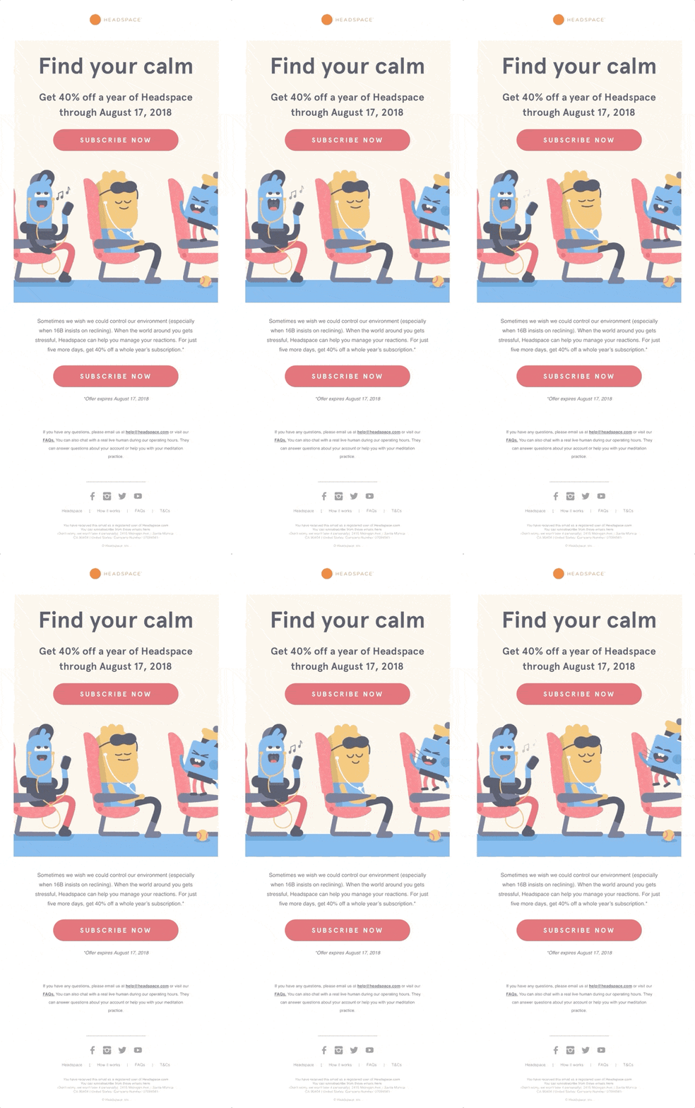
Take a look at the email example from Headspace. It is just one big animated illustration that speaks to the audience. It is undoubtedly a win-win solution that promotes an offer in a friendly and cheerful way.
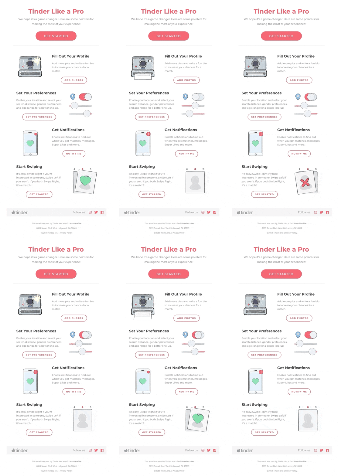
Another good case in point is an email from Tinder that employs custom illustrations charged with small dynamic effects. As a result, they feel alive, engaging, emphatic, and meaningful. Unlike the previous example, you can see a range of small icon-like illustrations scattered throughout the design. They are used as supporting material that enhances the message and clarifies things. Along with that, they create an overly friendly atmosphere and make onboarding a piece of cake.
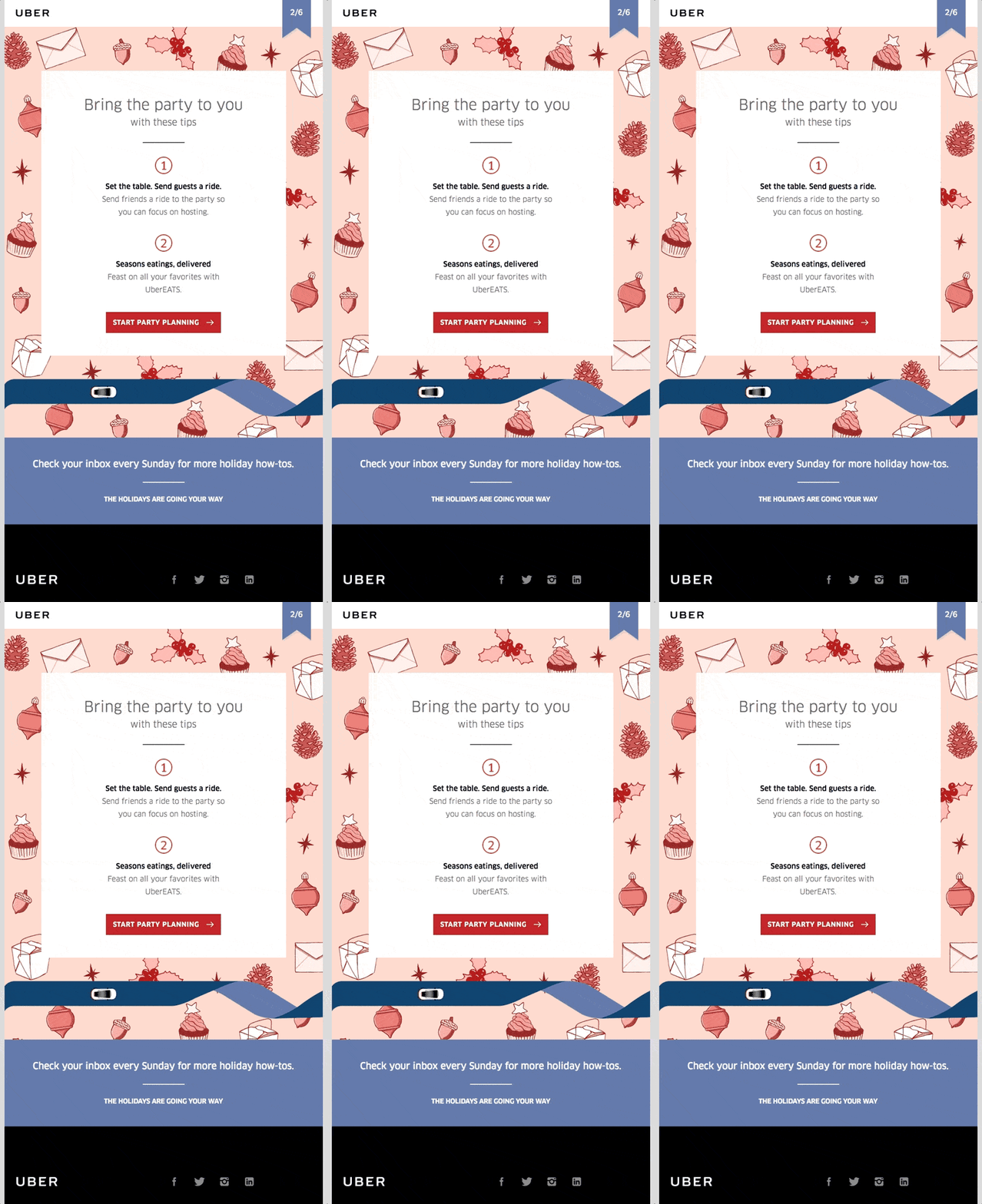
If small animations feel like too much for your target market, then you can always use one yet big illustration. However, instead of placing it on the top, you can use it as a background.
Consider an email from Uber, which uses an adorable illustration on the back. It has a strong charisma and powerful personality, without a doubt. Nevertheless, you are not overwhelmed by it. Everything is well-thought-out. Used on the back, this animated illustration sets the proper festive mood and certainly earns extra points for the brand. Smart.
The vital thing to remember when you play with this trend is responsiveness and accessibility. To save yourself from trouble, use Postcards, which is famous for providing their newsletter templates with impeccable responsive behavior. Plus, you will find customization options that let you add information for AT.
Animated Gifs and Interactive Details
While some trends come and go, the tendency of using non-static solutions such as animated gifs, tiny dynamic effects, and interactive features stay with us for several years in a row. Dynamic elements are a colossal email trend for 2021. Let’s consider the main aspects closely.
Animated Gifs and CSS-Based Effects
Animated GIFs and CSS-based effects will play an essential role in conveying the message, generating traffic, and bringing in extra leads in 2021.
Everyone is bored staying at home and isolating; therefore, some action in your digital newsletter may easily make the day and turn the subscriber into the brand’s ambassador.
What’s more, initially, this duet was used to make the user experience more engaging and spicier; now, it is used to achieve marketing goals.
For instance, animated GIFs can often be seen as instruments to draw attention to promoted offers, establish a sense of urgency and even evoke fear of missing out. Timer countdown is a case in point.
Another popular solution is the use of fortune wheels and scratch card-like experiences that play other psychological tricks on humans.
Consider the newsletter example from Sueteness.
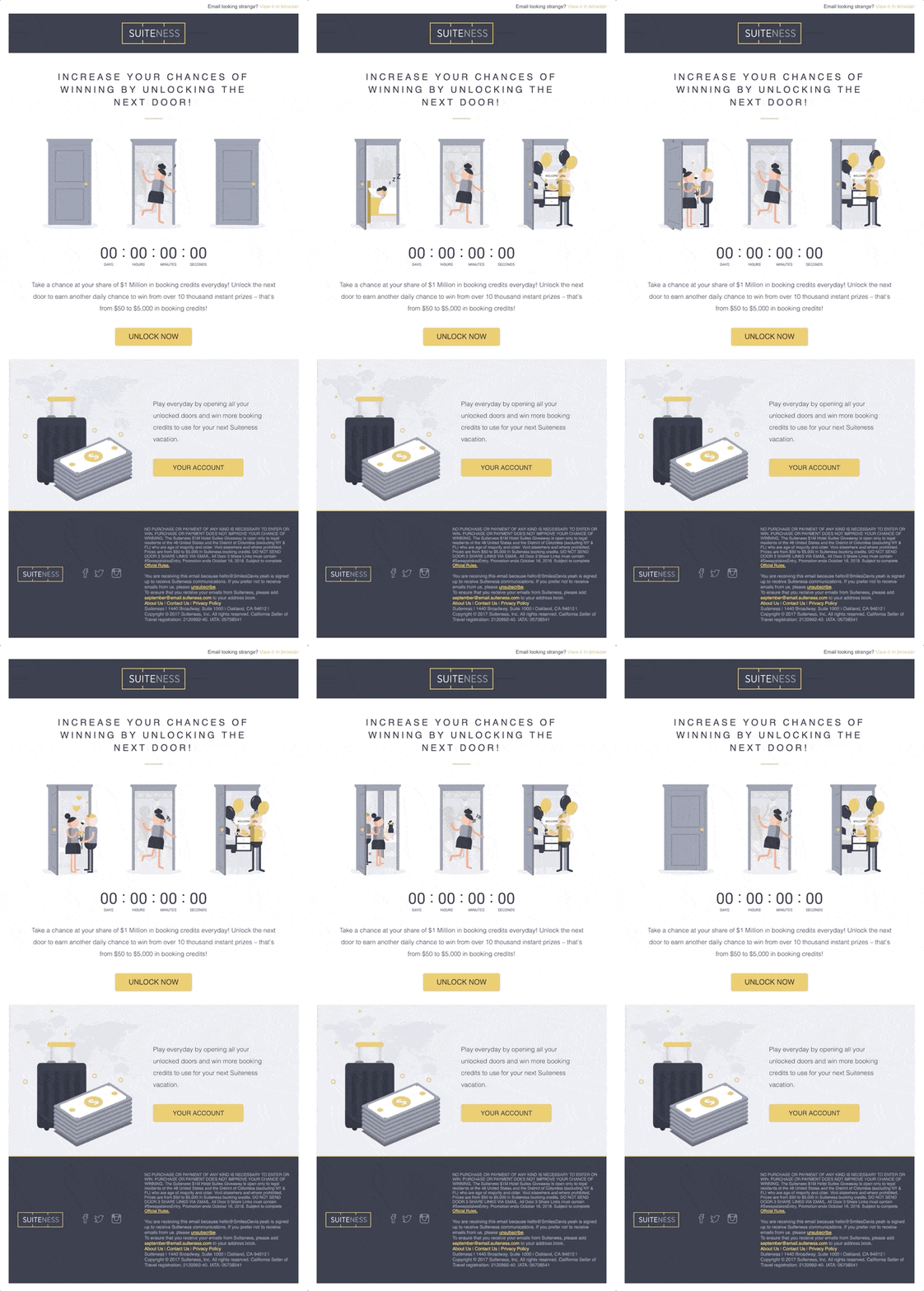
As an integral part of the giveaway campaign, this email served as a follow-up reminder whose task was to notify users on how to increase chances of winning the prize and push them to act swiftly.
As you can see, there are two animated gifs. The first one visually supports the main message, whereas the second one is a classic timer countdown that establishes a sense of urgency. Note the atmosphere. It is friendly. The animated gif, in tandem with an illustrated approach, helps to avoid a pushy tone. As a result, the email design looks amiable and unobtrusive and certainly gives customers a nudge. Clever.
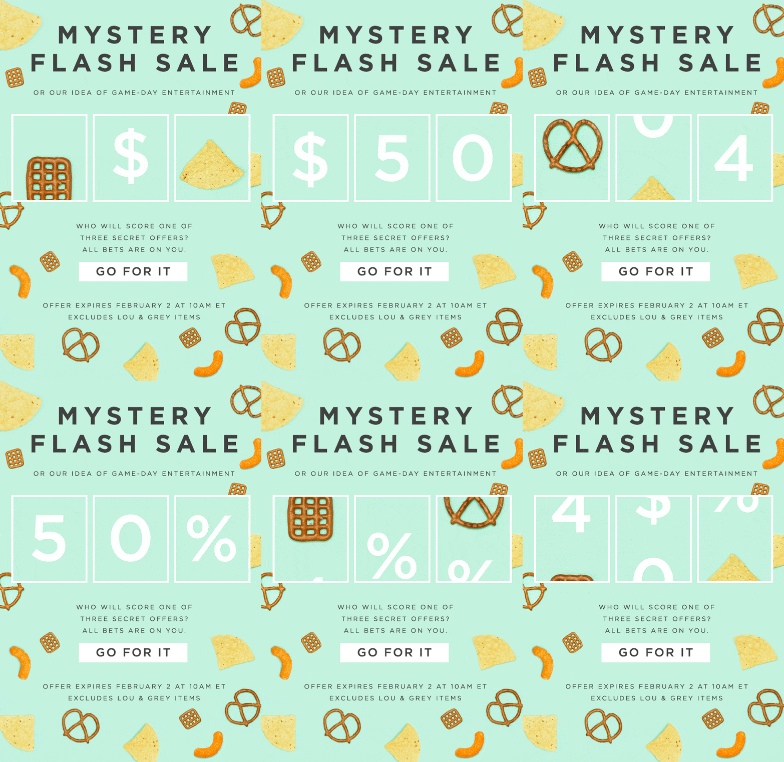
Another good example is this Mystery Sale. According to statistics, Flash sales bring a 35% lift in transaction rates. To achieve this effect, popular brands employ animations. Consider this slot-machine experience. Although all we know that it is just a looped animation, it still works. More so, it is not evident from the first seconds. Therefore, some customers may easily fall for it. The main thing is, it sets the right expectations, kindles interest, and pushes contacts to visit the website right away.
Interactive Features
Let’s be honest, interactive emails are still on a low start. However, the situation is improving. Thanks to AMP, you can finally give them a much-needed boost.
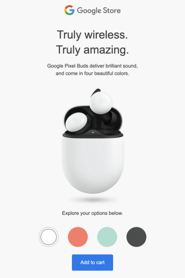
What’s more, although this tendency is still in its infancy, it has a huge fan base and already offers some interesting solutions. For example, take a look at the promo newsletter from Google.
Generally speaking, it is a regular email that advertises the product featuring its benefits in a well-organized manner. At first glance, it seems that there is nothing special, but that’s not exactly true. The deal is, there is one small detail that takes the newsletter to the next level. This detail is an interactive header that lets clients choose the color of Pixel buds. It brings value to the customers by making their decision more informed. It also makes the experience more enjoyable. Indeed, small details make a big difference, especially when they are interactive and meaningful.
If you want to try this trend in your email design, use Postcards. Not only does this platform come with all you may ever need to create a high-converting HTML newsletter template within minutes, but it also encourages you to use safe interactive features. Check out this good tutorial that explains how to add interactive hotspots to Postcards email templates without much hassle.
Conclusion
The harsh truth is packaging sells. Email design plays a vital role in the success of a marketing campaign; it should be stylish and modern.
As the tastes and preferences of subscribers evolve, the email design should also see some changes. Like it or not, but you need to adapt. Therefore, follow email design trends since they are your polar Star that shows the path to success. Keep track of the latest tendencies and bring to life those that most fit your brand, campaign, and of course, audience.
Source: https://designmodo.com/email-design-trends-2021/

