


Mobile devices have taken over the web. Thus, so much designer attention has (rightly) gone towards ensuring that the websites we build are compatible. We are constantly refining how we implement responsive features so that they work flawlessly on small screens.
While this is a worthwhile endeavor, there are other screens to think about. Large viewports are also a pretty important consideration. It’s rare to find new desktop or laptop devices with screen resolutions below 1080p (1920 x 1080). And both 4k (3840 × 2160) and 8k (7680 x 4320) monitors provide even more screen real estate.
Taking advantage of large screens can be a challenge. The key is in creating a layout that is both usable and legible. In addition, care must be taken to avoid overwhelming users by placing too much in front of them.
If you’re looking to build a website that takes advantage of large screens, we’ve put together some general rules of thumb. They may not fit every situation but will provide you with some factors to mull over before you go big.
Scale Text and Parent Containers Accordingly
Full-width text on a 1080p or 4k screen is a big no-no. It takes too much effort to read and keep track of where you are within a passage. The more text you have, the more difficult it will be for users to digest.
Therefore, text works better when it’s within a limited-width container. Consider an ideal width to be no more than 900-1200 pixels. Whitespace is also important as it allows for some breathing room. Experiment with various container sizes, margins and padding to find what works best with your layout.
Font sizing is also a key factor when designing for large screens. Increasing the font size helps text to stand out and also limits the number of characters displayed on a given line.
Finally, consider increasing the CSS line-height property for adequate vertical spacing between lines. This improves legibility and adds some openness to the overall design.

The Atlantic limits article text to a narrow, easy-to-read container.
Take Advantage of Multi-Column Layouts
One of the big advantages of utilizing extra screen real estate is that it provides plenty of room for multi-column layouts. Perhaps that’s why this technique is often seen on news-oriented websites.
With a traditional 1,000-pixel grid and a layout consisting of three or more columns, the content within tends to get squeezed. A page width of, say, 1,800 pixels allows columns to be spaced with substantial margins. And there’s still room to add internal column padding while bumping the font size up as well.
A wider page can also enable the use of some advanced column configurations. For example, think of a “Latest News” area that takes up the left half of the page – complete with a featured image. Then, two 25% width columns show other text-based headlines to the right.
This may be the perfect type of layout for large screens. It avoids wasted space while potentially making it easier for users to identify content that interests them.
Even better is that a combination of CSS Grid and media queries allow you to cater to the biggest screen resolutions while gracefully adapting to smaller ones.
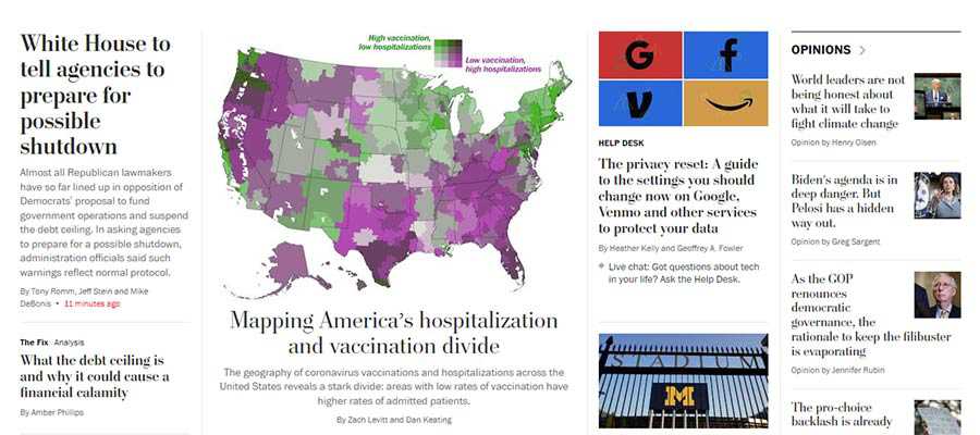
The multi-column home page of The Washington Post.
Keep Important Items within Reach
Among the potential pitfalls of a super-wide layout is that some key items may require the user’s cursor to travel quite a long distance. At the very least, it’s an inconvenience and poor UX. At worst, it might be considered a pretty big accessibility issue.
However, these concerns can be addressed through design. A top navigation bar can be horizontally centered on the screen so that it doesn’t require a ton of mouse movement. Making it keyboard-friendly can ensure it’s accessible for those who don’t use a pointing device.
The extra width also means that other important pieces could easily get lost in a forest full of content. Elements such as login forms and calls-to-action need to be placed in highly-visible areas.
Integrating them into the site’s header or a static sidebar are possible solutions. A “sticky” header may also provide a path for keeping the most important items consistently within reach.
There’s plenty of room for creativity. But the main idea is making sure that users don’t have to constantly traverse the width of their screen to get to where they want to go.
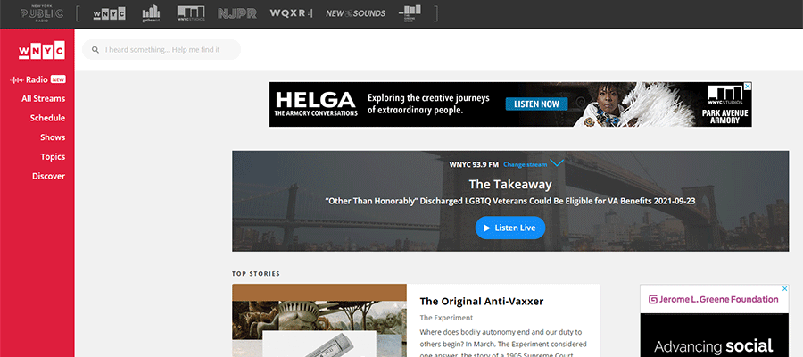
WNYC Radio utilizes a brightly-colored static sidebar to keep their website navigation in view.
Use Predictable Design Patterns
Taking all of the above into consideration, the overarching theme is in creating a predictable design pattern. This means that the website’s layout allows content to flow in an intuitive manner. While certain items can be designed to draw attention, they shouldn’t detract from the overall user experience.
How does this work in practice? One example is the aforementioned multi-column layout. There may be several sections on a page that utilize columns, each with their own unique number and positioning. That’s fine, so long as there are consistencies in spacing, typography and related styles.
On a news-oriented website, this might mean that the “Technology” and “Editorial” sections have different column layouts. The “Latest News” section could even utilize a different background color. If they are consistent in look, however, it helps to create a flow while also avoiding a monotonous browsing experience. Each section stands out, yet blends into the overall design.
As with any design project, a lot of planning and experimentation is needed when designing with large screens in mind.

LG utilizes an alternating pattern of column layouts on their home page.
Make Effective Use of Those Extra Pixels
The beauty of large, high-resolution screens is that they can be used to create an immersive experience. We see it all the time with games, movies and other media.
Accomplishing this with a website is a bit more of a challenge, though. It’s especially difficult with a text-heavy site. There are some definite risks when it comes to usability.
Still, a well-crafted layout can effectively take advantage of the extra screen real estate. It’s a matter of ensuring easy navigation, legibility and consistency in design.
However, these are the principles that web designers practice each and every day. Keep them in mind and you’ll create a website that looks pixel-perfect on everything from a handheld phone to a massive 8k monitor.
The post The Challenge of Designing Websites for Large Screens appeared first on Speckyboy Design Magazine.
