What is the future of user interfaces (UI)? Many designers struggle with this existential question every day. With Artificial Intelligence (AI) becoming more creative, will humans still have a job designing user interfaces in the near future?
- The near future is mobile as new mobile users shift the majority of internet users.
- New pools of talent are coming to the workforce, radically shifting the mainstream.
- AI, voice control, smart devices, and augmented reality (AR) are finally taking a foothold in UI
- Skeuomorphic design might come back
- Neumorphic design might be headed for a resurgence too.
Skeu·o·morph·ism: a digitally created design made to look like tools, implements, or real-world physical objects.
Neu·morph·ism: “new skeuomorphism;” a minimalist, flat design with extrusions, blurs, shadows, or 3D effects to create or exaggerate the illusion of depth with 2D layered flat objects.
In the next year, the way we interact with our computing devices won’t change dramatically. It will keep changing though, little by little. The mainstream acceptance of UI novelties will continue to migrate slowly. But the question is: What will things look like in five to 10 years? How should UI and UX designers prepare and adapt their websites, apps, and content?
The mainstream may stay the same, but don’t get me wrong; radical things are happening. Devices are becoming more robust, reliable, and lightweight. Location awareness and on-device machine learning are replacing stop-gap technologies.
Devices are acting more like us. They’re more aware of their environment, and app interfaces are based on more information. This explosion of data is happening in all devices – not just phones. Even smart speakers and hybrid devices are dramatically changing in their ability to sense and respond to their surroundings.
UI Design Is the Result of Failure – a lot of it
If you’re using an interface right now on your device, it probably looks very refined but also has a couple of things you disagree with. The reality is there have been many iterations of that interface that have failed. Those things you dislike? Half of them are the new normal. The other half won’t make it to the next update.
People are voting with their hard-earned income on devices.
In fact, according to a 2019 Pew research study, more than half the world’s population owns a smartphone. But the most significant changes aren’t happening because of previous owners in richer geographies like Europe and North America.
New owners have a significant influence on how web design and apps are about to change in 2021.
In developing countries, young people are purchasing smartphones three times faster than in developed countries. These young people are the consumers and designers of the near future. In North America, designers are tweaking website and app designs. Adapting won’t be easy, especially when we expect a couple of billion new users with unique tastes to appear on the market in the next five years.
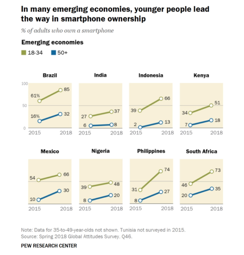
New mobile device adoption is three times more potent in these places compared to North America or Western Europe.
The youth coming from countries like India will be making a lot of our future design decisions. Large population increases (and thus large numbers of young people) and a large potential market of people without smartphones are likely to culminate in the market’s domination soon.
Although young people are the most concentrated in all developing countries, there are just nine hotspots with the largest number of young internet adopters:
The top nine places for new, mobile internet user growth are:
India, Nigeria, the Democratic Republic of the Congo, Pakistan, Ethiopia, the United Republic of Tanzania, the United States of America, Uganda, and Indonesia.
Although mobile and desktop UIs attract similar amounts of web traffic, most of the emerging internet users will use mobile devices.
For example, in India, where 80% of users access the internet by mobile device, 1.6 billion new mobile users might be added in the next five years. That’s almost doubling the global mobile device ownership with one country alone.
When you consider that many African countries have similar numbers of mobile users, it’s not hard to see that the era of the desktop is quickly fading.
More users and designers from India and Africa will influence UI design in 2021 than ever before. The U.S. will still have influence, but many companies will focus on global appeal.
Let’s take a look at how these global cultures are likely to influence UI around the world.
Future Users Have Different UI And UX Preferences
Now that we’ve thought deeply about who the future users are, we need to think about their experiences. User Interfaces (UI) and User Experiences (UX) are strongly interlinked, and to predict where UI is heading, we need to talk about the experiences and preferences of our new future user base.
We’ve taken the liberty of browsing the Dribble “places” for some of the up-and-coming countries in our list. For India, I see lots of pastel colors and a resurgence of neumorphic design.
Neumorphic Design
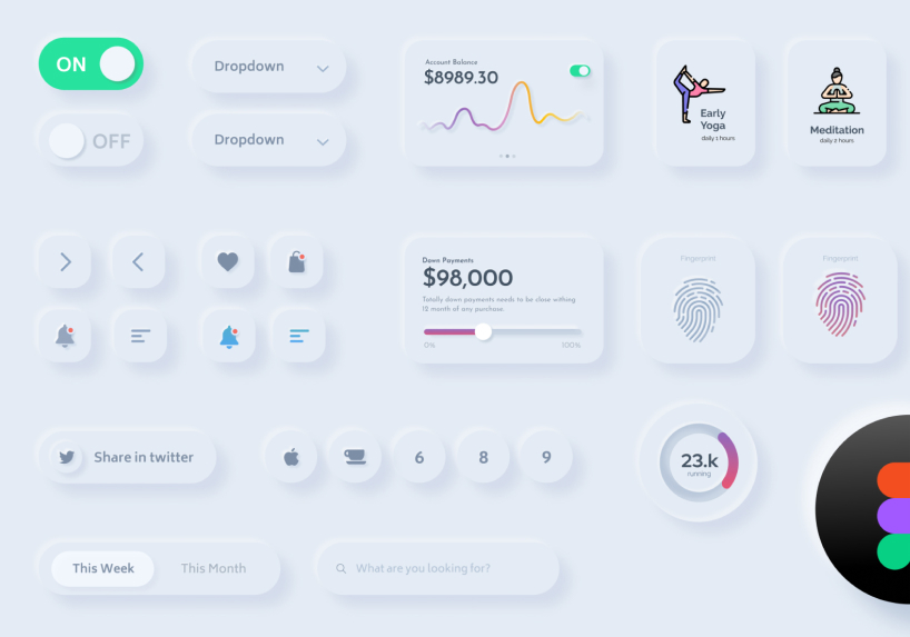
If you haven’t seen neumorphic, it’s similar to skeuomorphic, but combines elements of flat design. It’s basically not entirely flat. Flat objects have depth through primarily shadows or blurs that give them a sense of layering.
Indian Designers: Global thought leaders seem to be fully embracing neomorphism.
Dark mode in India seems to be gaining in popularity, but only 20% of designs on “dribble/places/India” are dark-themed. Purple and pink colors are trendy, followed by oranges and greens. No surprise here – Indians are superfans of color.
I also noticed a rise in character designs like the one here:
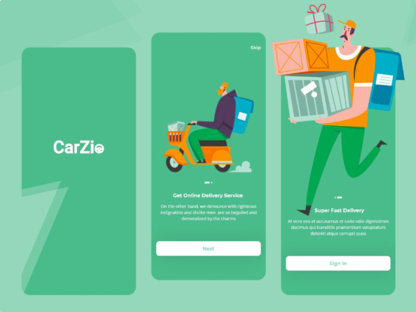
A lot of user interfaces from Indian designers are reaching for human shapes and figures. Some have neumorphic vector styles themselves, flat and nothing but a shadow to distinguish them from the background.
Others are bright and vibrant drawings reminiscent of traditional Indian artwork, with curly typography.
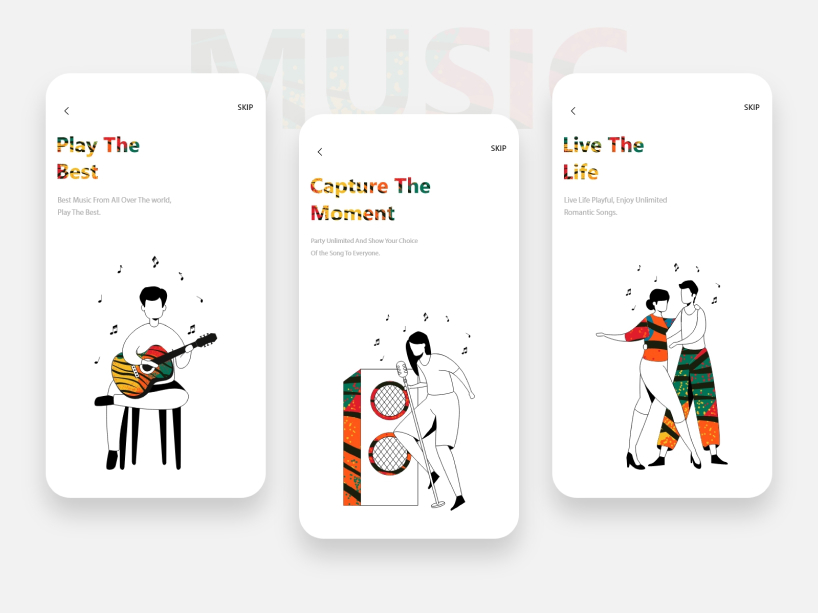
With India’s PM Narendra Modi recently banning a significant number of Chinese apps in 2020, a slew of new Indian UI designers and app developers have been thrust to the forefront. A new wave of unique Indian style is coming.
In the U.S., users are also shunning Chinese-owned apps, bringing a new kind of power vacuum for local and international designers to fill.
Nigerian designers: Subtle nods to earth and water.
The main difference between app design in India and Nigeria is the tuning of neumorphism. It’s like you took the neumorphism knob and turned it up 150% in India.
In Nigerian designers’ works, the shadows, embossed buttons, and layering are much more subtle. Colors gravitate toward earth and water tones, with splashes of gold, dark blue, and teal in many designs.
We see these design elements in many apps and websites today. In the next year, users around the world are gravitating toward muted, earth tones, symbols, and themes.
A common element I see in Nigerian UI are caricatures. In both app and web design, it’s common to see a miniature human being demonstrating the functionality or otherwise bringing presence to stark modern flat worlds in both app and web design.
It’s hard to say whether these characters are a product of African influence, but many of them make their way into North American apps and websites. Because of the remote life of 2020, many users seem to respond well to these characters. They add life, social feeling, and humanity to otherwise stark flat design landscapes.
The Democratic Republic of Congo is not what you think.
If you search “congo” on Dribble (or another designer listing), you’ll find jungle themes, traditional African masks, vectorized pottery art, and other tropes of Africa. But are these the themes that Congolese thought leaders are genuinely poised to bring to the mainstream?
Many of the “congo” designers are actually not from Congo, so it’s clear the western stereotypes are global. To understand Congolese designers more, I need to delve deeper.
How Nimble Designers Can Make Waves
COVID-19 has changed the world in more ways than we can count, but how has it influenced design? Many people are quarantined at home, spending more time on their mobile phones than ever before. Designers can capitalize on this if they’re smart.
Let’s look at the viral designer Anifa Mvuemba [https://hanifa.co/] and her usage of VR to showcase her new fashion line on Instagram. Product designers like her are making radical moves into new technologies out of necessity.
Startups like Anifa’s company “Hanifa” are voting by their content that the future is mobile, and presenting strong cases for virtual reality and augmented reality. Mobile devices are the vast majority (over 90%) of devices in DRC, so it’s not a surprise that we see websites that don’t look like they should be viewed on a desktop at all.
I also think that the presence of characters in many designs today is partly due to the void we all feel in quarantine. With the global pandemic causing families to go many months without seeing extended family and friends in person, it’s easy to see that designers have a social element to fill.
Animated, vector, or hand-drawn, colorful characters are one of 2020’s most prominent design aspects.
We can see hand-drawn characters in many high-profile sites, like MailChimp.
UX Design – How Does It Influence UI
2020 was the year of the iPad with Magic Keyboard. With the next generation of iPadOS, the iPad is closer than ever to a full desktop experience. It’s steadily rising sales show that consumers and designers alike are reaching for the next way of computing and interacting with devices.
In the era of a global pandemic, the UX for many of us is sitting on our couches using our phones. We interact with content on the web, social media, and our daily feeds. Users make this content. We share, and our audiences consume our shared ideas, products, and likes.
UX means User Experience. That’s the study of the user’s senses, emotions, thoughts, and actions when interacting with your device, content, place, or product. If it can be designed, a UX designer must consider the holistic effect on the user.
UX design doesn’t need to be only about apps. It can be about video content, VR, or even architecture. For example, plans for a new hospital maternity ward take into account the highly dynamic hours, days, weeks, and months surrounding giving birth. UX designers in hospitality and health care feel deeply about the usability of their spaces and interfaces.
UI design takes cues from the existing structure to see what’s trending, but they also design completely new things that are informed by UX. For example, skeuomorphism came to the fore mostly out of necessity.
People weren’t familiar with touchscreens at the time and needed extra visual emphasis to understand how buttons, sliders, and interfaces worked. By mimicking familiarity, UI/UX designers slowly modified the user interface design, powering today’s flat modern style.

Video also has helped smooth the transition from skeuomorphism to modern flat design. Creating the most engaging video content or animating our favorite characters and buttons goes a long way toward optimizing on-app engagement.
UI Is Shaped by Big Thought Leaders
And it shouldn’t shock anyone that big tech has scouted many of today’s cutting edge designers. Let’s not forget how much of an influence these trillion-dollar behemoths have.
How Amazon and Microsoft Are Contributing to the Shifting Landscape
Ten years ago, proposing the idea of falling in love with an AI was far into sci-fi, and fringe at that. Today, an estimated 14% of men have reported having feelings for Amazon’s Alexa. Earlier this year, Microsoft acquired an exclusive license from OpenAI for the most advanced language AI ever, GPT-3.
It’s safe to say that conversational design UI is changing dramatically, especially if you interact with your content or application with your voice. AI text-to-speech (TTS) sounds incredibly lifelike in 2020, and I think in 2021 cloud-based TTS will be indistinguishable from a real person. (Yes, GPT-3 is that good.)
And Alexa’s artificial intelligence algorithms now learn your phrases that only you say. It’s now learning from you like your best friend might adopt a lot of your mannerisms. It knows when you’re going to keep talking.
By recording your speech patterns, Alexa now knows to continue listening to you. It knows when you’re not talking to it and picks up subtle cues when you want to include it in the conversation.
In short, AI is becoming like a buffer between us and the internet content. It’s acting as a natural intermediary, using how we prefer to interface with each other through conversation.
How Apple Is Shifting UI Design
Apple’s hardware and iOS design thinking are profoundly affecting the world, but it’s not just about rearranging the pixels. Siri, the ubiquitous voice on every iPhone, was released only nine years ago. Shortly after, the movie Her was released. That’s the one where Joaquin Phoenix falls in love with his AI assistant, played by Scarlett Johansson.
The new iPhone 12 has wireless “MagSafe” charging, another step toward making a portless phone. And Apple has snuck a new “LiDAR” device onto the “Pro” versions of many devices. Both design changes seem to be slowly marching toward the dream of ultimate minimalism.
At the same time, Apple has steadily improved the Apple Watch, giving it more health care relevance, this year, adding blood oxygen sensors to the wearable. On Apple’s new smartwatch for 2020, the Siri voice assistant also performs flawlessly.
The Apple watch has been on the market for several years. UI designers have diverted some attention to the tiny screen. But this year, Apple released yet another screen size which is likely to be extra-popular, especially in developing markets.
The iPhone 12 mini is the smallest iPhone made in years. Designers will have a tough time developing mobile apps, with more decisions than ever required to keep user interaction consistent across a dizzying array of device sizes.
But this isn’t the only radical change rumored for the coming year. With the deployment of new LiDAR sensors, the rumor is Apple will collect testing data for upcoming wearable glasses.
The rumored “Apple Glasses” (unofficial artist’s rendering)
As many know, Google glass failed in part because of strict regulations against the forward-facing camera, once thought required for such a system. But if the camera could be replaced with a micro-sized LiDAR for situational awareness, privacy and regulatory concerns would evaporate.
It’s exciting to think that Apple may smash the processing power and screen tech from Apple Watch with the hyper-efficient sensors, batteries, and wireless of the AirPods and give AR to the masses in a year or two. I can only imagine how excited Apple would be to demonstrate all its digital products virtually, right in your living room.
How Will UI Design Work in Augmented Reality?
Augmented reality (AR) today is the phone camera of 2005. Not quite what you’d want to use to save your memories with, more of a cool gadget to show off. Still, Google Glass gave us a glimpse of how it might be used if it becomes mainstream.
The forward-facing LiDAR seen in self-driving vehicles can recognize objects by their shape and texture, so it’s not far-fetched to assume Apple’s LiDAR will do the same. (LiDAR sensors can kind-of see in black and white.)
Object cues could then have overlaid icons, text, or interactive components that stick to the real world’s objects and update new data from the internet in real-time.
Will these icons be in the ubiquitous modern-flat style? Or should we look forward to a future semi-flat neumorphic design? It’s a good bet that skeuomorphism in a world of everyday AR will come back in force since users need training on the completely new interface.
I don’t think the black-mirror-esque AR is very far off. Already, VR and AR training and tourism is becoming mainstream, with 700% more users than ever traveling the world with Google Street View. Hospitality, retail, and tourism will adopt this technology at a striking pace.
UI may even diverge as much as we see differences in architecture around the world. I think we’ve seen modern flat design emerge primarily because it’s best for our eyes and fingers on a small glass touch screen. In AR, when the world is our canvas, I’d bet UI design will get much, much more exciting.
Source: https://blog.boxmode.com/ui-design-trends-for-2021/


