Pantone, that secretive cult of color, has emerged from their cave of silence and once again graced us with the color of the year.
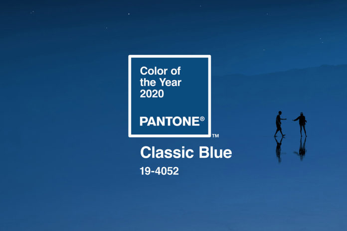
And this year it’s blue.
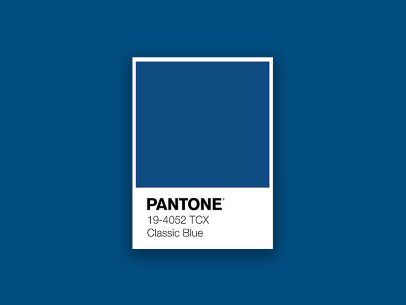
But, lo, not just any blue—CLASSIC blue.
That’s right. It’s the same color that adorns your LinkedIn profile or the blue jeans you’ve worn for a week straight without washing. It’s a foundational shade, in both fashion and home decor, the color of the sky before night falls, a stretch of ocean reaching out to the horizon indefinitely, your Pepsi, seemingly every tech logo in existence, and your Blue Apron delivery.

So what does this mean?
Well, much like when Pantone selected Cerulean Blue as the color of the millennium in 1999, there is a sense of constancy and dependability that comes with it, something that isn’t lost on us as we move into another decade full of uncertainty. Pantone describes this shade of blue as one that elicits feelings of calm, clarity, and assurance—you know, all of the emotions you experience when you open up Facebook on your phone.
“We are living in a time that requires trust and faith. It is this kind of constancy and confidence that is expressed by PANTONE 19-4052 Classic Blue, a solid and dependable blue hue we can always rely on,” said Leatrice Eiseman, Executive Director of the Pantone Color Institute, in a press release. “Imbued with a deep resonance, PANTONE 19-4052 Classic Blue provides an anchoring foundation. A boundless blue evocative of the vast and infinite evening sky, PANTONE 19-4052 Classic Blue encourages us to look beyond the obvious to expand our thinking, challenging us to think more deeply, increase our perspective and open the flow of communication.”
For the first time in Pantone’s history, they’ve also created a multi-sensory experience by partnering with the likes of Firmenich, AudioUX, LANDR, and The Inside so that we can all taste, smell, and hear Classic Blue.
“As we all head into a new era, we wanted to challenge ourselves to find inspiration from new sources that not only evolve our Color of the Year platform but also help our global audiences achieve richer and more rewarding color experiences,” said Laurie Pressman, vice president of the Pantone Color Institute in the same press release. “This desire, combined with the emotional properties of PANTONE 19-4052 Classic Blue, motivated us to expand beyond the visual, to bring the 2020 Pantone Color of the Year to life through a multi-sensory experience.”

From the press release:
- The sight of the Color of the Year 2020 Pantone 19-4502 Classic Blue: Imprinted in our psyches as a restful color, Classic Blue brings a sense of peace and tranquility to the human spirit, offering refuge. A reflective blue tone, Classic Blue fosters resilience.
- The sound of the Color of the Year 2020, in partnership with Audio UX: The sound of Classic Blue is nostalgic and takes us to a place that is comforting and familiar.
- The texture of the Color of the Year 2020, in partnership with The Inside: The feel of the color fabric translates into a soft, velvety texture, further emphasizing the calming quality of the color, while eliciting feelings of empowerment to expand the mind and build foundation for the future.
- The taste of the Color of the Year 2020, in partnership with Firmenich: The taste of the color is described as gentle and elegant, and explores the idea of maturing through ripening.
- The scent of the Color of the Year 2020, also in partnership with Firmenich: the scent of the color elicits contemplation and a feeling of optimism for the future, with notes of blue water and sea salt lifted by airy sky.
Pantone has also partnered up with Adobe Stock and curated a special collection of images that usher the color into 2020, which you can view here.

PANTONE 19-4052 to be exact. The shade is elegant, simple and enduring, and Pantone says it instills “calm confidence and connection”. Whatever your opinions on this enduring shade, it’s sure to influence graphic design trends in 2020.
It makes sense that we’re trending towards less outlandish palettes right now – it feels like we’re living in turbulent times, and a calming, dependable shade could the perfect antidote. Or as Pantone puts it: “This enduring blue highlights our desire for a dependable and stable foundation on which to build as we cross the threshold into a new era.”
Colour theory suggests blues like this particular shade are restful and tranquil, and Pantone also says it’ll promote concentration. Ideal. There’s a very zen video you can watch below, if you’re feeling frazzled.
Do you agree that we could do with a little stability in our lives right now, or does Classic Blue feel like a dull choice? The jury is still out.
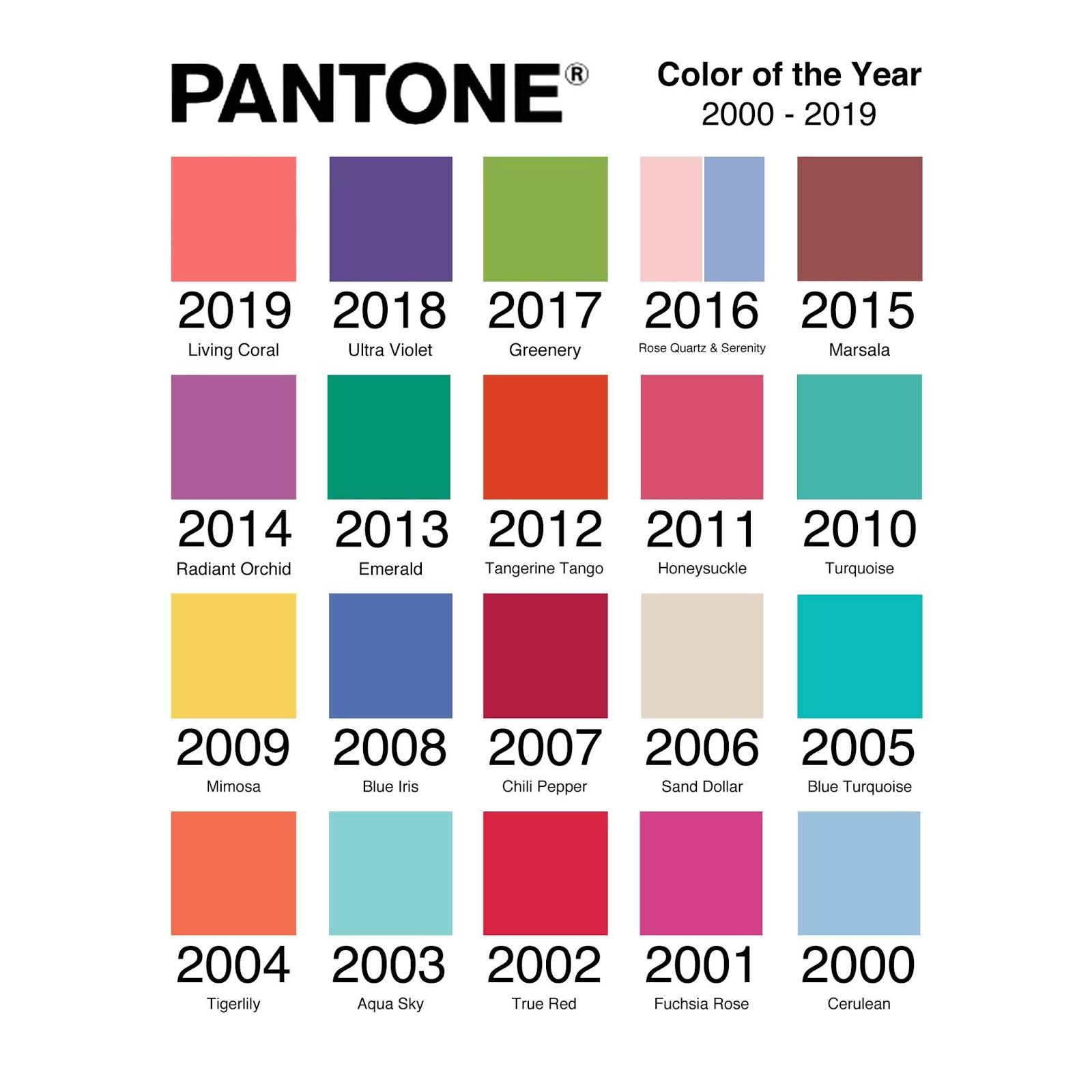
It’s certainly a bit of a departure from recent Colours of the Year. In the past few years Pantone has opted for more invigorating or unusual choices – 2019 celebrated the vibrant Living Coral, 2018 was all about the enigmatic Ultra Violet, and in 2017 it threw out all the rules and chose two shades, blended together. Of course, this could just be the repeating cycle of trends making another loop, rather than something more profound.
Read more at Pantone.
Past Colors of the Year:


