


Although the title indicates that this text is intended for every designer, it is good to have everyone consider how a particular color has an impact on a particular situation or emotion.
We are all aware of the connection between colors and emotions, that is, we know that a certain color affects positively or negatively on our mood.
What we would like to point out in this blog post is the role that plays the colors in creating a picture for a particular brand, that is how designers and marketers use them to get the effect they want.
To put it simply, warm colors stimulate a sense of excitement, give energy and courage, while the opposite, cool colors of the spectrum, such as blue or green, give a sense of calm and security.
Knowing this information, marketers and designers use the color spectrum to induce the desired emotions and feelings in a particular target group.
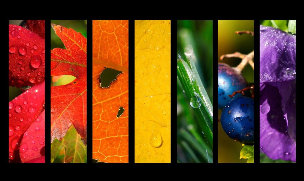
So, for example, the yellow is a cheerful color that stimulates the feeling of optimism and attracts attention. Although it is thought to be an optimistic color, research suggests that people are more sensitive and babies cry more when they are in yellow rooms. This color stimulates concentration and accelerates metabolism.
The orange color radiates heat and stimulates cheerful emotions. Because it gives us a sense of emotional stability and a positive attitude, it is good to use it when we pass through more difficult periods of life. This color is associated with adventure and risk taking, so it would be good to be part of our everyday life, whether we will wear an orange blouse or choose an orange note note.
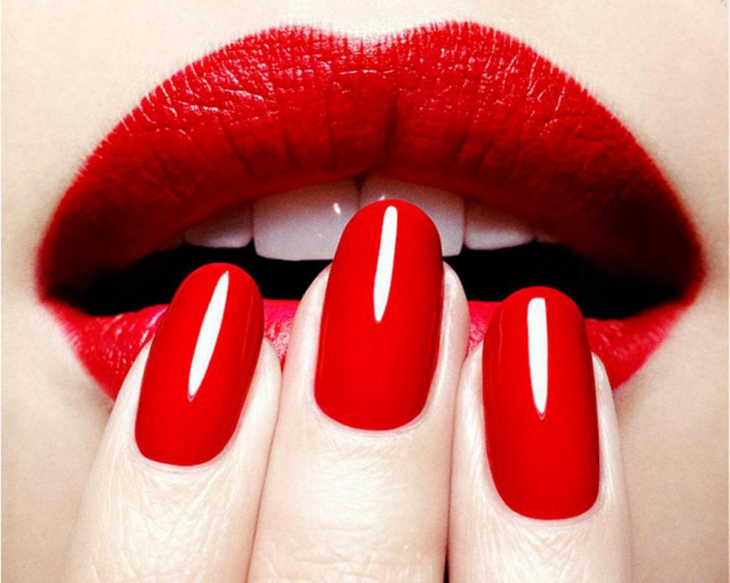
Red is the most intense color in the spectrum that accelerates the pulse, gives the impression of dignity and courage. Draw attention and you should be careful when you decide to wear something red. Too much red acts aggressively and aggressively, while a detail in red will help you to separate yourself from the crowd. On the other hand, its lighter, romantic variant – the pink color appears to be calming. Knowing this, some sports teams are painting the walls in the dressing rooms where their opponents are pink in order to diminish their energy.
The most mysterious, mysterious color is purple. This noble color stimulates creativity, intuition and imagination. It is often associated with sophistication and luxury. It contains the strength and energy of the red color and the comfortable blue color. It associates on individuality, uniqueness and independence.
The color of the sea and the sky gives the opposite impression of the red. Blue color gives you confidence and calmness, so it is often used in the bedroom.
Because it symbolizes loyalty, it’s advisable to wear a blue dress in a job interview. People are more productive when working in a blue room, while blue exercise halls and fitness centers give more strength and durability to those who practice.

Green color symbolizes nature, everything that is alive, healthy, everything that grows and develops. It acts calmly and is most easily acceptable to the eye because it has everywhere in nature. Those who use this color want to create a sense of relaxation, relaxation and bring freshness into everyday life.
The gray is a cold, neutral and timeless color. It does not cause emotions like the rest, it maintains a balance because it represents totally opposite colors – black and white. This color is quiet and reserved, does not stimulate, does not give energy and does not cause the excitement of the one who perceives it. Although associated with maturity and responsibility, it will never be the center of attention or leader in the color spectrum, precisely because of its neutrality and calmness.
We hope that this information and guidance will help you create product designs that should encourage some customer emotion. We encourage you to experiment, create and enjoy the role of graphic designer.


